
Redesigning a Mobile
Ticketing App for Public Transit
End-to-End UX Design • User Research • Usability Testing • B2G2C • Native iOS and Android
Overview
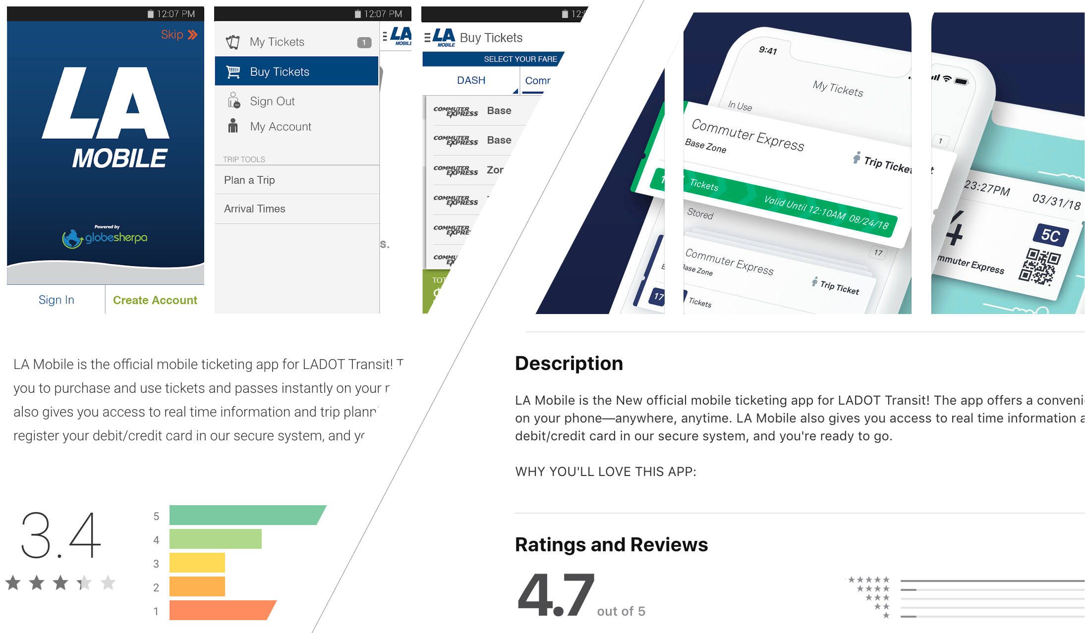
Moovel's mobile ticketing app served transit riders for over 4 years as a web app. Combined with an aging codebase and usability issues, we had the green light from leadership to redesign our biggest revenue producer from the ground up. This project is an uplift from a web app to native iOS & Android.
About the Company
Moovel North America partners with transit agencies to provide iOS and Android mobile ticketing applications for riders, along with backend management tools for transit operators and inspection staff.
Key Outcomes
App Store stars gained within first month of launch
Users tested across remote and in-person sessions
Expansion achieved, overtaking competitors
ROI through user-centered research and design
My Role:
Lead UX Designer- User Research
- Design Team Mentorship
- Stakeholder Workshops
- Usability Tests
- User Journey Mapping
- Competitive Analysis
- Prototyping
Challenges & Opportunities
- Long purchase process and time to ticket launch
- Lack of support for payment methods
- Accidental ticket activations
- Bloated navigation
- Crashes and odd behavior due to old codebase
- Frustrated clients
- Dated design
Simpler Navigation
Our hamburger-style navigation caused problems. Not only had it been debunked as a good design pattern for hiding navigation, increasing cognitive load and becoming a "junk drawer," it doubled the amount of taps our users needed to navigate quickly from "Buy Tickets" to "My Tickets." And it was out of thumb reach.
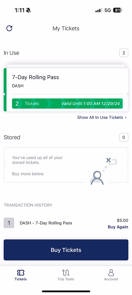
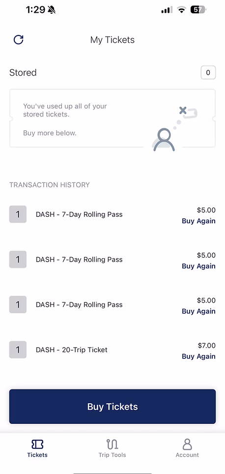
I updated the new design to follow the UX Law of Proximity with a navigation tab group, located within comfortable thumb reach with prioritized user actions. I consolidated the "Buy Tickets" and "My Tickets" functionality into a single "Tickets" tab to better align with mental models.
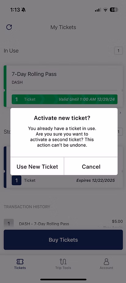
Protecting Purchases
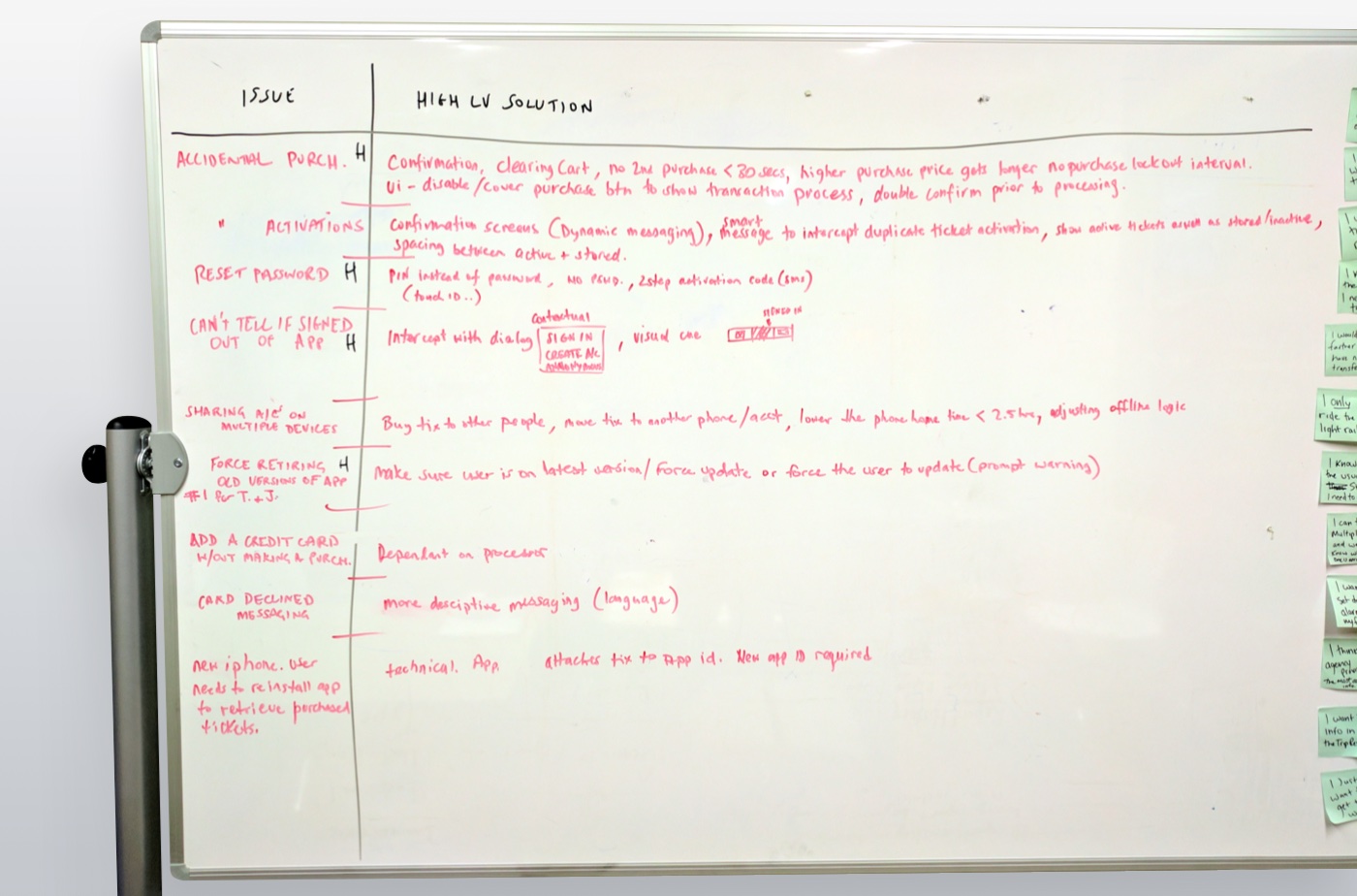
Many users called customer support after accidentally activating a stored mobile ticket. Through my customer service workshops, I discovered this was one of the top 10 pain points causing user frustration and support calls.
I introduced two design changes to reduce this problem:
- I made the 'In Use' ticket more obvious with color and animation to draw the eye and empower users to find it quickly.
- I added a confirmation alert when someone tries to use a stored ticket while one is already in use.
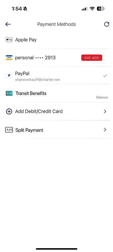
Better Payment Options
Through user interviews and stakeholder workshops, I learned many riders receive employer benefits towards transit, particularly in the DC area. I also discovered we were missing out on a revenue opportunity because we didn't have a way for users with transit benefits to use 100% of their balance.
In addition to adding Apple Pay and Google Pay to the available payment options, I introduced a new split payment method that allowed people to use all of their transit benefits balance. Purchases made with transit benefits increased after introducing this payment method option.
A Faster Purchase Process
From user interviews and ethnographic observation, I uncovered two new insights about audience behavior:
- Time pressure: Many riders purchased tickets while boarding the bus or train. The long process to purchase a ticket caused these riders to bottleneck the boarding process, frustrating operators and other riders.
- Routine behavior: Riders purchased the same type of ticket. Transit trips are usually routine. They are either to and from school or to and from home with the same origin and destination.
I designed a simple pattern called "Buy Again," a button that pre-loaded a previously-purchased ticket into the shopping cart. This reduced the time to purchase from 25+ seconds to under 5 seconds, solving both the time pressure and routine behavior challenges.
My Research & Design Process
1Customer Service Expert Workshops
I facilitated workshops with customer service teams to uncover the top 10 user pain points. Workshop attendees used dot voting to prioritize the most impactful issues to solve, creating empathy for both users and support teams.
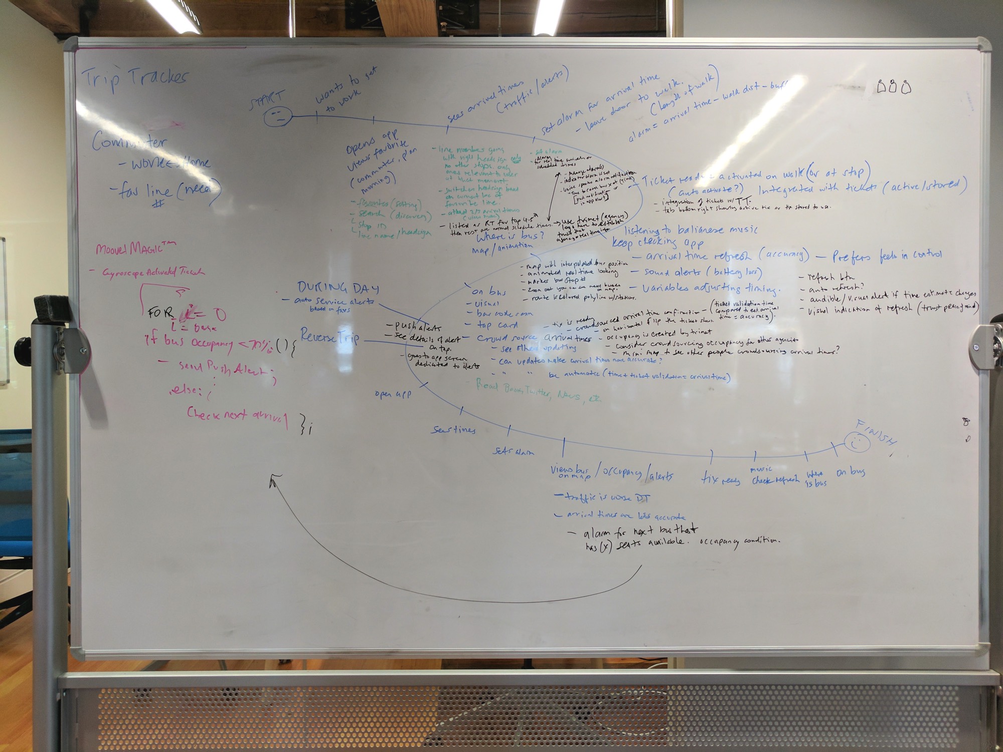
2End-to-End Journey Mapping
I conducted journey mapping sessions with current app users, inviting them to our office to share their complete commuting experience. This revealed touchpoints beyond the app that affected the overall experience.
3Iterative User Testing
I tested prototypes with around 60 users both remotely and locally. Data was collected in EnjoyHQ after Usertesting.com sessions and Ai was used to in addition to manaul processes to identify patterns and inform design iterations.
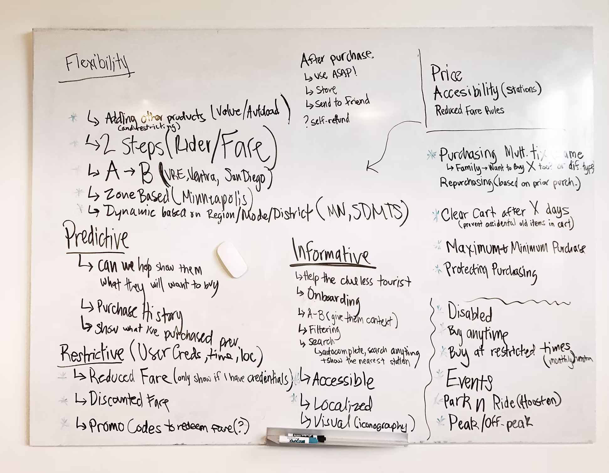
The usability testing was a way to create thematic goals for the redesign, itemizing important new feature requirements, and comparing design strategies.
Setting thematic goals for the redesign
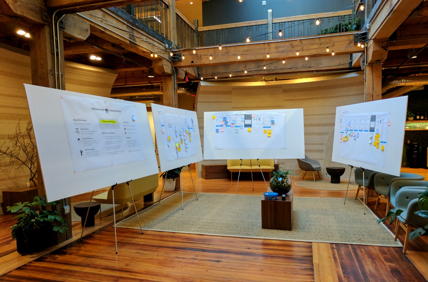
4Company-Wide Design Review
To ensure stakeholder buy-in, I organized a strategic Company Design Review using large foamcore boards placed in high-traffic areas. This "design trap" led to valuable feedback on technical constraints and innovative solutions.
Want to see more about this case study?
This case study covers the key improvements I made through UX research and design. I'd love to share more about conducting user workshops, stakeholder collaboration, design retrospectives, and the detailed research methodologies that informed these solutions. Send me an invite to chat sometime and let's talk shop.